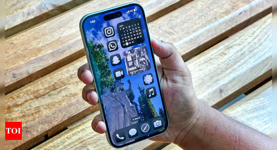
Yet, their appeals – if there were any – fell on deaf ears for years to the people sitting in that fancy spaceship campus in Cupertino. The power of the iPhone and the cult of Apple perhaps reined them in from a full-blown revolt.
Apple, however, has answered their prayers, gift-wrapped the customisation in a nice box with a card that reads: “Welcome to iOS 18”.
Home screen that feels at home
You might think I’m joking when I say that iOS 18‘s superpower is to paint icons any colour and put them all over your screen. But, I am not. With Apple Intelligence unavailable to most iPhone users, this seemingly simple customisation is the main plot point of iOS 18.
I know an Android person reading this right now would perhaps be doing an eye roll. Don’t. I know we’ve been a little late to the party, but let us have some fun, too. However, that’ll be a little out of character for an iPhone user like me, who’s been rather used to being locked away in grids and no colour on their home screen. But iOS 18 let me break those shackles, have the home screen of my dreams and paint it red.
It’s as easy as it could get. No jailbreaking or creating a Siri Shortcut, which is quite a task, to be frank. Just press and hold the home screen, tap the Edit button in the top left corner, and play around with the bunch of options there. You can choose the icon size, colours – have them light, dark, or tinted. And again, you can put the icons wherever you want, literally anywhere.
One of my favourite customisation options has been that I can just enlarge the icon size, which hides away their names and makes the home screen feel a little eased out (you know, what I mean). But that leaves some extra space at the bottom of the home screen right above the app tray, which could have accommodated one more row of apps, and while that irked me in the beginning, I have settled down with it.
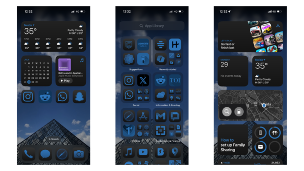
Then comes the option to colour up the icons – though you might not always like the colour that your iPhone has chosen for you, you can always play around with the colour picker and choose for yourself, or simply have them dark. Or you can leave it automatic, so when the sun sets, your icons also turn dark with the wallpaper. Though, third-party apps had a hard time matching up to the theme, but one can hope for things to get better.
So, what did I do with all this power bestowed upon me? I painted several home screens, some ugliest to their core and some so beautiful I couldn’t stop awing at my skills. It may just be the home screen dream come true for many, isn’t it?
The only thing now I need is the power to remove all the apps from my home screen at once. I hope you’re listening, Tim.
More control over “Controls”
The changes don’t end here. Remember how all of a sudden we all were swiping down rather than swiping up for the Control Centre? Well, that remains the same, just that you’ll have to swipe a little extra. However, there is a big change — the Control Centre is paginated, customisable, and a little colourful.
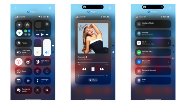
Just like on the home screen, you can move around the controls and change their size. They no longer need to be round and can also be changed to rectangles or squares, all having rounded edges. You can stretch the network panel and the music widget to occupy the whole page; they also have their separate pages by default.
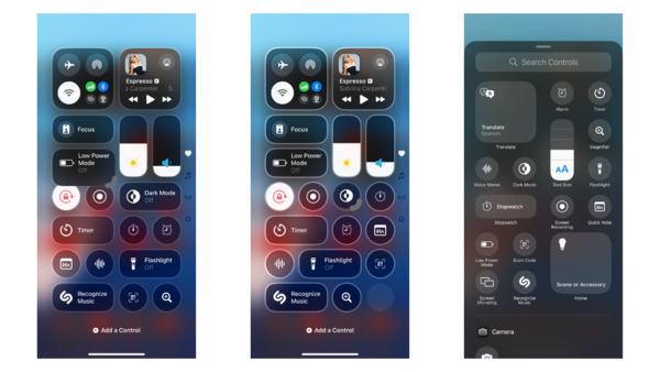
That’s just the first page, called Favourites. There is a whole gallery for controls, much like the widgets, and that’ll also include controls from third-party apps, so you can pick all you want and have a second, a third, and as many pages as you want.
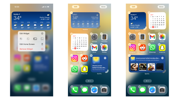
Speaking of widgets, there are a few new first-party widgets for the home screen, like Vitals, Journal and Training Load. And if any of the apps have a widget available, you can resize the icon of that app into a widget or vice versa.
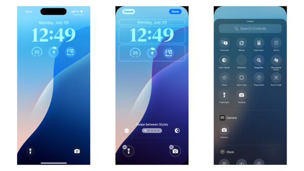
There’s one more Android power that’s been granted to iOS: the ability to customise the quick buttons on the lock screen. Yes, the era of the long-lived flashlight and camera combo on the lock screen comes to an end. Exactly like Control Centre, now you can choose different quick controls, ranging from dark mode to calculator, or even shortcuts. Soon, there should be third-party options available too.
Lock or hide the apps way
While it would have been nice to have the option to customise the App Library, it seems to be saved for future versions. Because you can’t have everything you want, right? But you can have things that really matter to you. At some point, while using your iPhone, you might have wondered about having the option to lock apps or even hide them. Well, in iOS 18, that’s possible.
So when you long press an app icon, you’ll be presented with two options – Require Face ID or Hide and Require Face ID. The first one essentially means “lock” and the other one is the “hide” option.
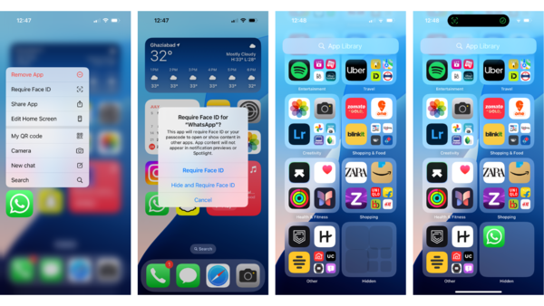
Now, when you lock an app, opening it will need Face ID, and it’ll continue to show up on the home screen. But if you want to make an app vanish from your home screen, choose the hide option.
Hiding an app will make it disappear from the home screen, and it’ll settle down in a hidden folder in the App Library. You can find this folder at the bottom of the library, and it won’t preview the app icons until you unhide the apps using Face ID.
A safe house for all your passwords
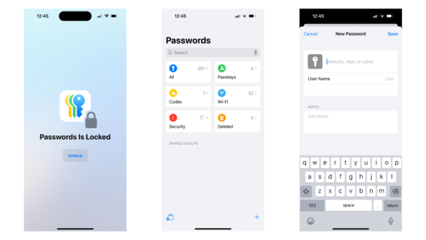
Now that we are on the topic of privacy and safety, let’s also touch on the Passwords app. Yes, iOS (iPadOS, macOS, visionOS, and Windows, too) now has a first-party password manager of its own. All the accounts, Wi-Fi passwords, and Passkeys now sit inside the Passwords app, outside of the Settings. The app will also send you alerts if any of your accounts get compromised.
All this syncs across devices, so if you are saving a password on your iPhone, that’ll also work on your iPad, Mac, or even Windows PC for that matter. You can also AirDrop the passwords to others.
Well, this isn’t entirely new; the Keychain has been serving the same purpose for a while. But you might or might not have been aware of this. So, with a separate app that sits right in your App Library, it becomes easier to manage the passwords.
One privacy change that I really appreciate is the option to decide which contacts I want to share with an app. Rather than giving an app access to all contacts, you can now choose just the contacts you know you’ll need in the app. This way, the app won’t have access to all your contacts.
Photos app knows you
Among all the changes, the Photos app has been radically redesigned. Ditching the tabs, the app now has a unified page, combining Library, For You, and Albums – all on one screen. So, there’s no need to switch tabs anymore; all you need to do is scroll.
Up top is the Library, showing all the pictures you have taken, screenshots, or the ones you have saved. If you simply scroll up, you’ll get the good old Library view, with filters – Years, Months, All – plus sorting options, and a close button that returns to the default view.
Swiping right will show you the new Carousel, which will have featured photos, memories, favourites, and more. If you want, you can customise the upper half – add more Collections, replace the current ones, or remove them as well.
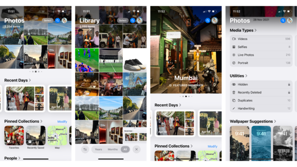
But there’s more going on in the bottom half. You’ll see Recent Days, People, Memories, and more. These have always been tucked away in the For You page, so again this is something you might or might not have come across daily or ever. But now you have these up front, so you can rediscover the oldest of snaps and have curated albums for the special days, your friends and family.
Scroll down further, and you’ll find more – like all the albums, different media types, deleted photos, and hidden ones as well.
Redesigns don’t come easy, especially for an app that you use almost daily. There’s for sure a bit of a learning curve. It took me a couple of days to get used to this layout, and for the first few days, I didn’t like it much and wanted the old layout back. But now that I have used it for over a month, I’ve come to appreciate how the new app just serves its purpose of discovering photos.
The blue bubble, green bubble saga comes to an end (sort of)
Next up is Messages. After adding a couple of handy new features like Stickers and Check-In, among others, in recent years, Apple is adding a few more this year as well. First on the list is RCS, the Rich Communication Services, the same messaging standard that’s been used on Android phones. It’s different that hardly any of us in India don’t even care about RCS.
But for those who are sensitive about the blue and green bubbles, how do things change now? Is this the end of the green bubble vs. blue bubble war? Well, both yes and no.
While you can now send pictures and videos without making them look like they’re from the 2000s, and even have read receipts and be in group chats together, the blue and green bubble divide still remains. Texts from your iPhone friends will still be blue and those coming from Android continue to appear green in Messages, though the two now have a more level playing field.
Though, I couldn’t use the RCS here in India as of now.
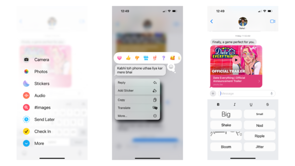
A feature to come that most of us would care about more is Send Later, which is a godsend for forgetful people and early sleepers like me. I can simply schedule a message, be it a birthday wish or something else, for up to a year in advance.
You can now use any emoji to react to a message, or even use a sticker for that. And if you like to be a little more expressive with your texts, you can use the new text formatting options or animate them with WordArt-style effects. Though, the old message effects are gone (not going to lie, they were a little more fun).
T9 dialer on iPhone, finally
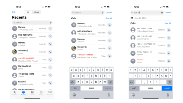
The Phone app has also received some love, bringing in a T9 dialer, so you can find contacts just by typing their name on the keypad. You can also search for previous calls, transcribed voicemails, and contacts right in the Recents tab. A little discovery I made is that you can type in a month in the search bar, and it’ll show you all the calls you made in that month.
Sorted emails
Since we’re talking about communication, let me quickly go through what’s new with the Mail app. There isn’t much new right now, but later this year the Mail app will gain some smarts that’ll help categorise emails into different groups – Primary, Transactions, Promotions, and Updates.
The Primary tab will essentially have emails from your friends and family, while other emails will be categorised in other tabs. A new digest view will also show snippets of receipts, marketing emails and newsletters grouped together by sender.
Notes learn maths
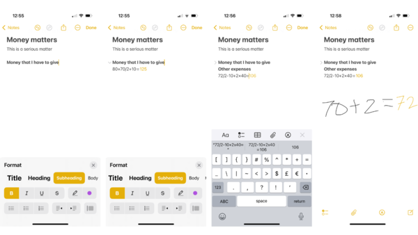
I am always on the Notes app, noting down one thing or another, and I guess I’m going to use it even more just because I can now have collapsible subheads and highlight text, so I’ll have neater-looking notes. And if that didn’t impress me enough, I can now transcribe conversations right into the app. Then, there’s the ability to do maths directly in the app.
Whether it’s adding up the budget for a vacation or splitting the grocery bill, all you need to do is type or write down the maths, and you’ll have the answer. The app even remembers these calculations in case you are sitting down for a long problem. And the same can be done in the Messages.
And maths gets a little fun
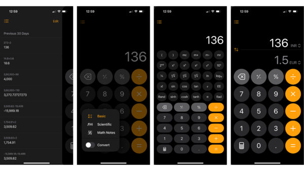
Oh, about maths, the Calculator app is being updated, too. The app can now do scientific calculations and unit conversions. It also shows all the previous calculations for the last 30 days, and if you want, you can delete a specific calculation or delete them all. That’s not it, the calculator can now do the expressions directly.
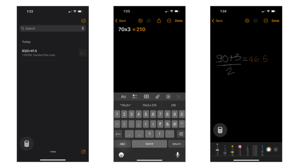
Apple calls it Maths Notes. It works just like you’d think. The toggle opens up a new note where you can do the maths. It functions exactly like the maths feature in the Notes app. You can type down the expressions or handwrite them, on and on.
The tidbits
One helpful addition that isn’t appreciated enough is the coupling of Reminders and the Calendar app. Alongside the regular calendar events, the Calendar app now also show the reminders. Not just view but you can also create new reminders, edit or complete them right in the Calendar.
Safari also got a couple of new features. The Reader is being redesigned; it now has a table of contents and shows a summary, so you get the gist of the article before you start reading it. Next is Highlights, which will highlight relevant information on a webpage. Though, I wasn’t able to use any of these features in the beta until now.
Coming directly from macOS, Game Mode is now available on iOS. It works as the name implies, ensuring that games play out perfectly. Additionally, there’s reduced latency with AirPods and game controllers.
If you’ve been journaling on your iPhone, iOS 18 brings some handy upgrades. You can now log your mood directly in the Journal app, with an option to count writing time as mindful minutes in Health. A new insights view shows your streaks and stats, making it easier to track goals. Improved sorting and search help you find old entries quickly. Plus, new widgets for your Home or Lock Screen offer writing prompts and streak displays.
Apple’s not forgetting about accessibility in iOS 18, and one helpful feature out of the lot is Eye Tracking, which’ll let one control their iPhone with just your peepers – no hands required. Then there’s Music Haptics, which syncs the Taptic Engine with the rhythm of songs, so those who can’t hear the beat, can feel it. Vocal Shortcuts is here for folks with severe atypical speech.
Wait, where’s the AI
Uhh, there is AI underlying iOS, but no Apple Intelligence for now. So, all the nice party tricks, like Writing Tools, Image Playground, and the new Siri, are late to the party. You should get them later this year, probably in September, though they’ll still be in beta and only available to those in the US. And that’s not the saddest part. The saddest part is that only those with iPhone 15 Pro and iPhone 15 Pro Max (and the newer ones coming this year) will only be able to get on the AI train.
Little heads up, the Apple Intelligence is now out for developers to test with iOS 18.1 developer beta. But, since it won’t be available for many of you all, I am going to talk about it separately.
Wrap up
It’s clear that Apple has made significant strides in customisation, personalisation and user control. From painting your home screen any colour to the revamped Control Centre and lock screen customisation, iOS 18 brings a level of personalisation that iPhone users have long desired.
The redesigned Photos app, while initially jarring, proves to be a more intuitive way to rediscover memories. Updates to core apps like Messages, Notes, and Calculator add useful features that streamline daily tasks. Then, there are more additions, like Game Mode, Eye Tracking, among others, and these add up to uplift the whole iPhone experience.
However, it’s important to note that this beta version is just a glimpse of what’s to come, with some highly anticipated AI, or as Apple calls it, Apple Intelligence, which promises a “more capable and helpful” Siri, not yet available and won’t ever be available for most people. Despite this, iOS 18 represents a significant step forward for the iPhone, blending some of the flexibility traditionally associated with Android while maintaining the polished user experience Apple is known for and most people would ever care for. So, wait till September, and y’all are in for a treat.


