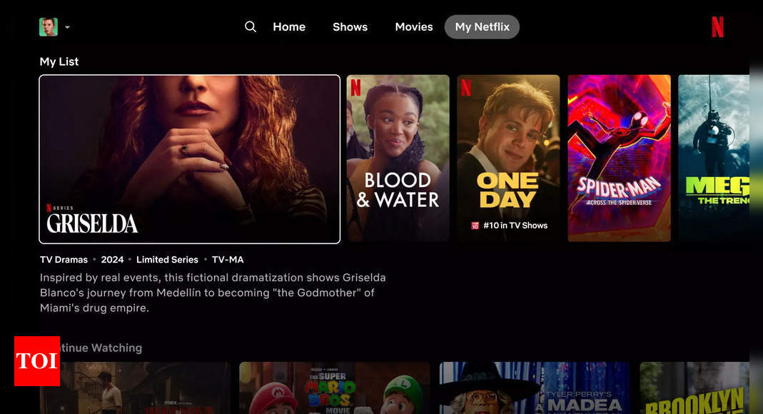
Netflix’s research revealed that users were spending a lot of time scanning the home screen, a phenomenon they dubbed “eye gymnastics.” They found viewers’ eyes darting between title rows, trending sections, artwork, trailers, and synopses.
“We really wanted to make that simpler, more intuitive, everything easier to navigate,” said Pat Flemming, senior director of member product, to Reuters.
What are big changes coming to Netflix with the redesign
Larger title cards: Thumbnails for shows and movies are now bigger, making them easier to see and potentially more enticing to click on.
Reorganized information: Information is presented in a more streamlined way, highlighting key details like whether a title was “in the top 10 for 8 weeks”.
“My Netflix” tab: A new section curates content specific to the user, including shows and movies they’ve started watching or saved to their list.
Simplified navigation: The menu has moved from the left side of the screen to the top for easier access, with core options like “Home,” “Shows,” “Movies,” and “My Netflix”.
When is the redesign going live for users
This Netflix redesign is reportedly currently being tested with a limited group of the company’s nearly 270 million subscribers. The company plans to use feedback to potentially refine the design before a wider rollout.
The focus on engagement time reflects a larger shift at Netflix. They view it as a better measure of customer satisfaction than just subscriber numbers, which they plan to stop reporting regularly next year.


